
This document outlines our strategic approach for the refined visual identity and digital presence of Talent Smart.
The objective is not to reinvent the brand. It is to bring the way Talent Smart looks and sounds into line with the standard the team already holds itself to: clear about what it does, warm in how it does it, and consistent everywhere it shows up.
This document translates the discovery sessions into a brand audit, a creative strategy and three visual directions, all built on the identity Talent Smart already owns.
- 01Brand Overview
- 02Brand Audit
- 03Creative Strategy
- 04Visual Direction
- 05Next Steps


Brand Overview
01

“Kind. Full stop.
Treat people well.”
Talent Smart is a specialist recruitment partner placing permanent and contract talent across technology, data and digital leadership, with growing specialisms in consulting, cruise, travel and hospitality.
It was founded eight years ago to break the mould of an industry with a poor reputation: not to chase fees, but to give everyone who makes contact, client or candidate, a memorable experience at every touchpoint.
Small by choice, structured by method and built on relationships that last, Talent Smart delivers headhunter quality at contingency rates, wrapped in genuine human kindness.
What You Told Us

Co-founded after 25 years at a previous firm, on one condition: that it was built the right way. Meaningful, not “build it fast, sell it off”.
To help clients plan and hire with confidence, and to help candidates find, define and live their purpose. Relationships, fit and long-term value.
Perceived as small, little known and based in one location, while delivering a premium, process-led service to well-known brands.
To be the trusted, go-to premium player in the small agency market: modern in its tools, unchanged in its care.
Mission and Why Now
Everyone who comes into contact with Talent Smart tells at least one other person they had an amazing experience, unlike any recruiter before.
Why Talent Smart matters now
Advert-response recruitment will be automated within three to four years. Sifting a hundred CVs down to three will not need a human in the middle.
What will last is the opposite: “Come to us with a problem and we’ll find the people who can solve it”, from a network, and a network’s network, that already knows and trusts Talent Smart. The brand needs to show that value clearly, today.

Brand Foundations
Talent Smart’s foundations are operating principles, not positioning statements. They guide how the team hires, how it treats every caller, and how the brand should speak.
For clients: anticipate, delight, do more than was asked. Not a fee attached to every activity.
For candidates: find, define and live your purpose. Careers treated as lives, not placements.
Hard to win, easy to lose. Honest advice with no motive other than the truth.
Everyone carries something invisible. A decline is never personal. Be curious, not judgmental.
The 35-step playbook, from qualified vacancy to first day. One declined permanent offer in two years.
Referrals, candidates and clients who come back and bring others with them.
One meaningful call beats twenty calls made to hit a number. No activity KPIs.
Very low staff churn. The consultant you meet is the consultant you keep.
Proof, Not Claims
The industry boasts about fees and placements. Talent Smart’s strongest brand assets are the human stories behind its work, and they should lead the communication.
A Brazilian systems engineer delivering for Deliveroo because nobody would give him a chance. Talent Smart persuaded Carnival to see him for half an hour. He sat the technical test with his baby on his lap and got the highest score they had ever recorded. Three years on, he is Chief Platform Engineer.
A role open for twelve months across four recruitment campaigns, never filled. Talent Smart had it once and filled it. Gatwick chose a smaller partner precisely so it could build relationships with the people doing the work.
A supermarket won’t stock the rare Cretan grape. A chain sells only what its structure holds. The independent merchant who knows wine and has the network will find it anywhere. That is the specialist Talent Smart is.

Brand Personality
and Voice
High empathy and high performance: a rare combination. Talent Smart should feel like a Rolls-Royce service for the price of a Tesla, from people who know what they are doing and genuinely care.
Brand Personality
- Kind, above all
- Warm and personable
- Expert and quietly confident
- Curious about people’s stories
- Contemporary, never corporate
Brand Tone
- Clear: understood in ten seconds
- Honest, never woolly
- Warm, never sentimental
- About them, never “me, me, me”
- Human, even when it is efficient
Audience &
Positioning
Audience
Clients first, because they are the hero of the story: second-tier technology leadership such as programme directors, IT directors, CIOs and CTOs, across technology, digital, consulting, cruise, travel and hospitality. Candidates second, but always cared for: senior specialists aged roughly early thirties to sixties, increasingly in roles where data, AI, product and human need converge. Growing: founders and board-level voices, reached through the podcast.
Positioning
A small Harrods rather than an Aldi. Headhunter quality at contingency rates, delivered through a structured process and a network that is known and trusted. Where big agencies pass clients between account managers, Talent Smart keeps the same people, the same care and the same standard.

Brand Audit
02
Reviewing the existing identity across logo, colour, typography, photography, podcast, social and website to define what is working, what needs refining and what to leave behind.
Logo and
Brand Mark
The current identity pairs a geometric wordmark, “talent” in a hairline weight and “smart” in bold, with the TS mark: a T and an S drawn as connected paths and nodes, built around the idea of connecting people.
Key Observations
- The mark is distinctive, recognised and still meaningful
- The connection idea is right for a network-led business
- The light/bold wordmark split is memorable
Refinement Points
- Hairline strokes break up at small sizes and on video
- Mark and nodes need consistent stroke and dot weights
- Define a standalone use of the mark as a graphic device

Current logo (white version) and the TS mark in the two brand colours
Colour
The orange and navy pairing is warm, confident and already recognised. It should stay. Blue and orange is also one of the pairings that stays distinct for the most common forms of colour blindness, so the pair works for everyone, including the team.
Key Observations
- Orange carries warmth; navy carries expertise
- The navy-to-orange gradient is used as a signature
Refinement Points
- Two oranges and two navies are in use; settle one of each
- An off-palette tan appears on buttons and underlines
- Orange 2 on white (3.7:1) fails contrast for small text
Colours measured from talent-smart.co.uk, September 2026. Gradient as used in page headers.
Typography
The website sets headings and body copy in Proxima Nova, largely in light weights, with Inter Tight for some interface text. The logo uses a separate rounded geometric face.
Key Observations
- Clean, contemporary sans serifs suit the brand
- Generous heading sizes on key pages
Refinement Points
- Light weights at small sizes are hard to read
- Proxima Nova is a paid Adobe font the team can’t use everywhere
- No defined hierarchy for decks, social and video
- Choose one family the whole team can use everywhere
We Help Progressive Organisations Engage With Expert Talent
Our intention is to deliver unrivalled service levels. We are fanatical about customer service and developing long term relationships based on delivering value and building trust.

Heading · Light 300
Body · Light 300, 13–14px
LABEL · TRACKED CAPS, ORANGE
Photography
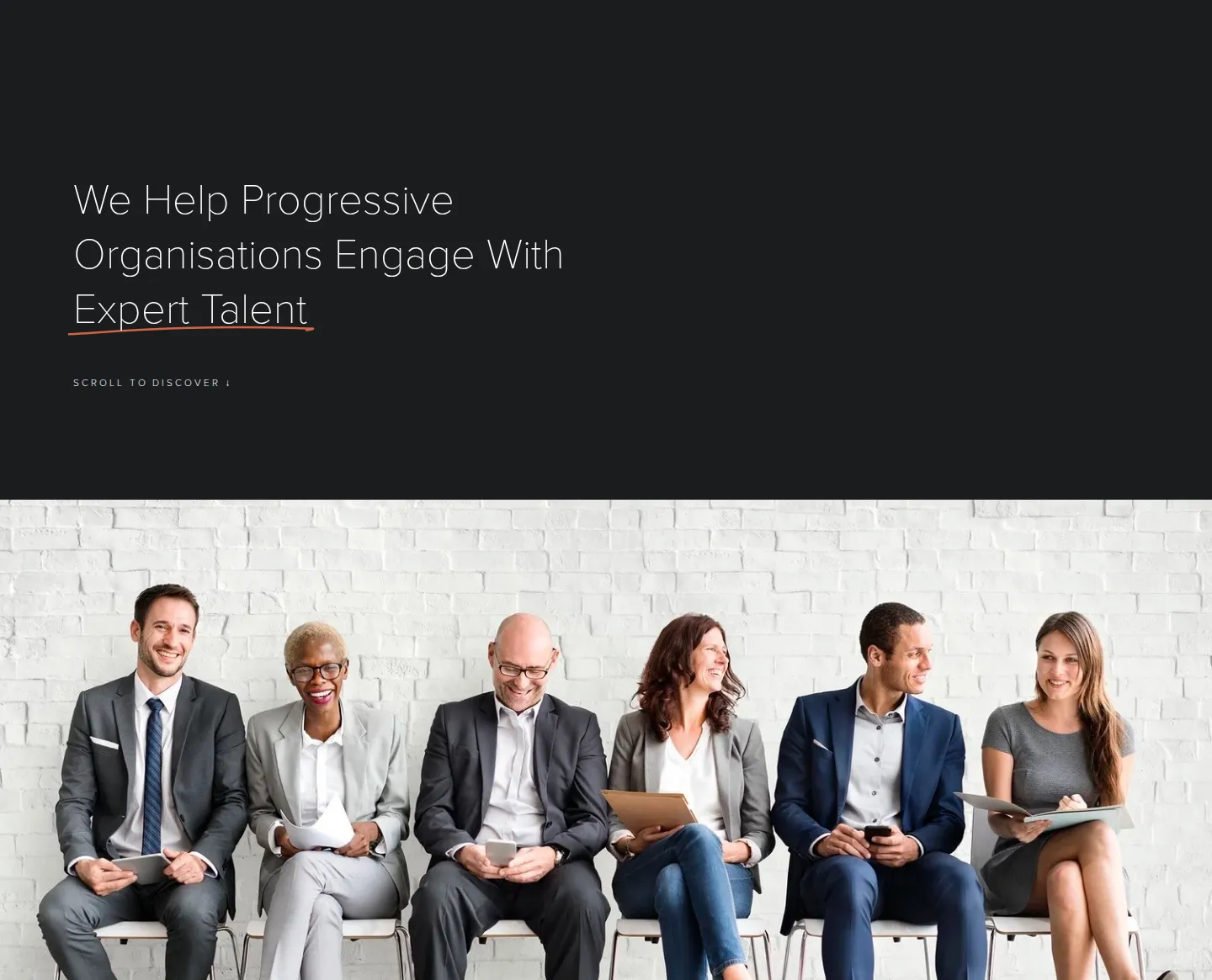
Two photographic languages sit side by side. The website relies on generic stock of suited people in a row, the image the team explicitly wants to leave behind. The podcast uses consistent black-and-white guest portraits: real people, real expertise.
Key Observations
- Podcast portraits are real, credible and consistent in tone
- People are always the subject, which is right
Refinement Points
- Replace posed, suited stock with candid people at work
- The same stock image is repeated across the homepage
- Define one grade for colour photography, one for portraits

Website today

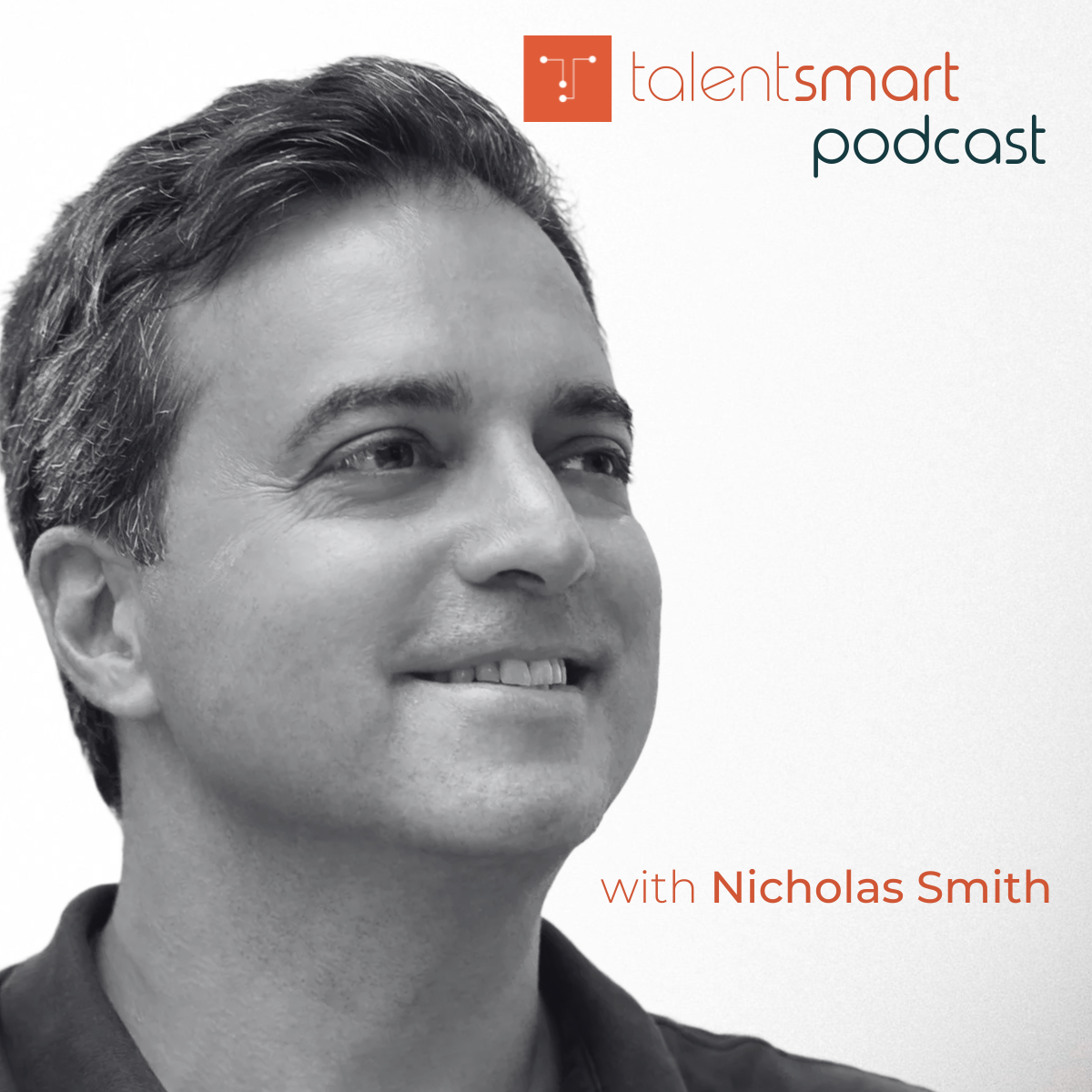
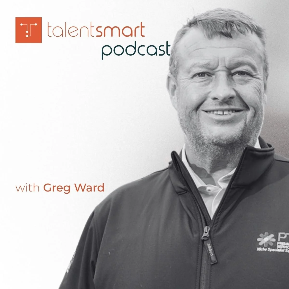
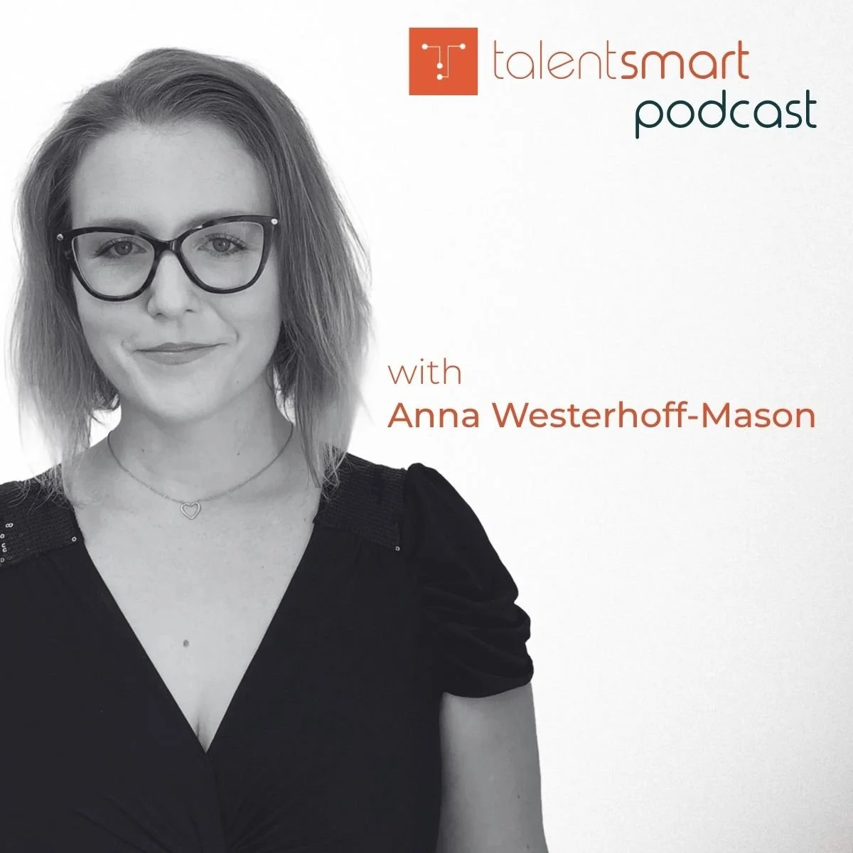
Podcast today: real guests, consistent black-and-white treatment. A strength to build on.
Podcast
and Social
Now in its third season, the podcast is Talent Smart’s most valuable original content, and its least consistent visual output. Across two seasons the covers use at least five different layouts.
Key Observations
- Strong guests from Linklaters, The Economist and HotelPlan
- Black-and-white portraits are a recognisable base
Refinement Points
- Mark and title move between four corners and two colours
- Titles overlap guests’ faces; guest names are hard to read
- One template family for podcast, jobs, news and announcements
- Formats beyond video clips for guests who decline them
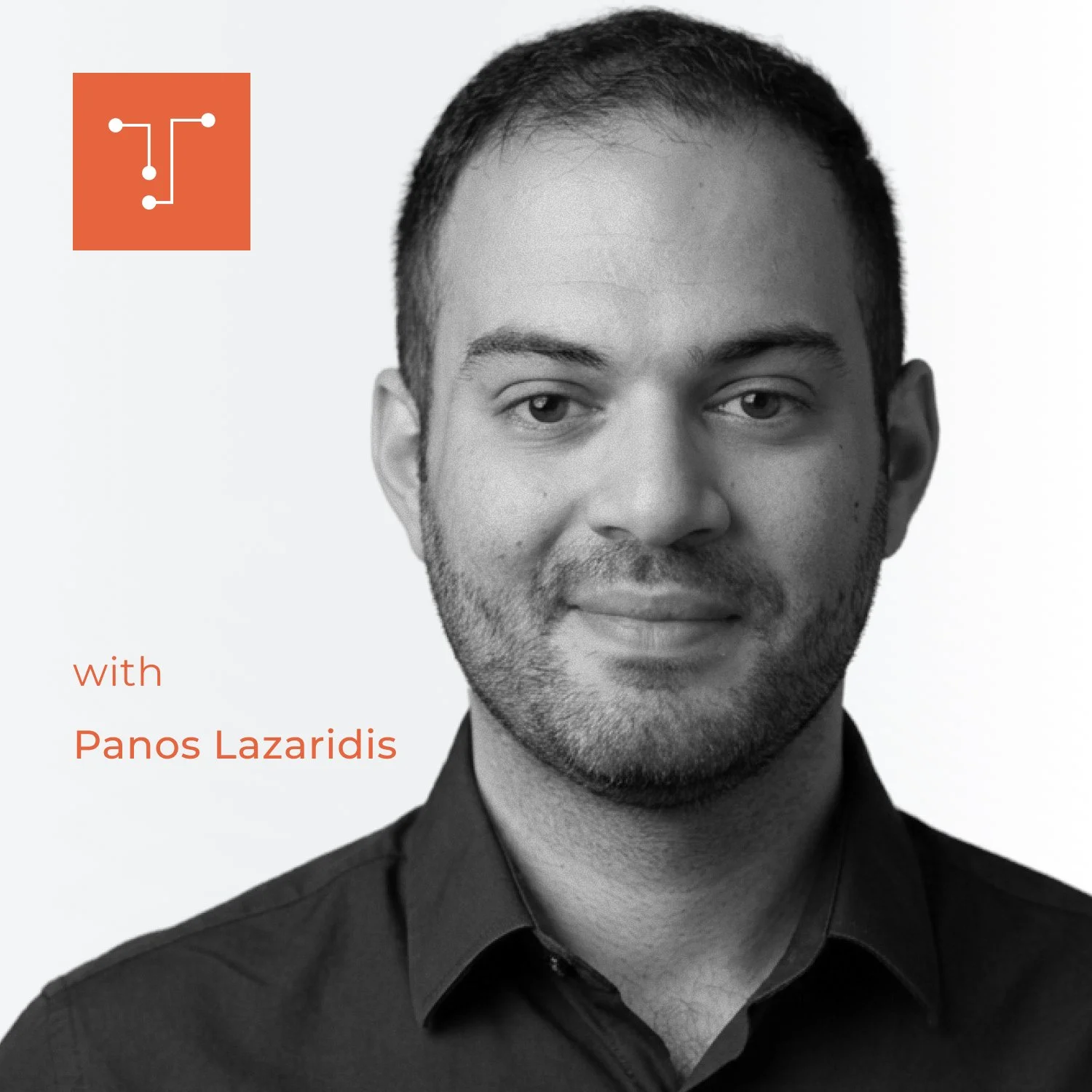

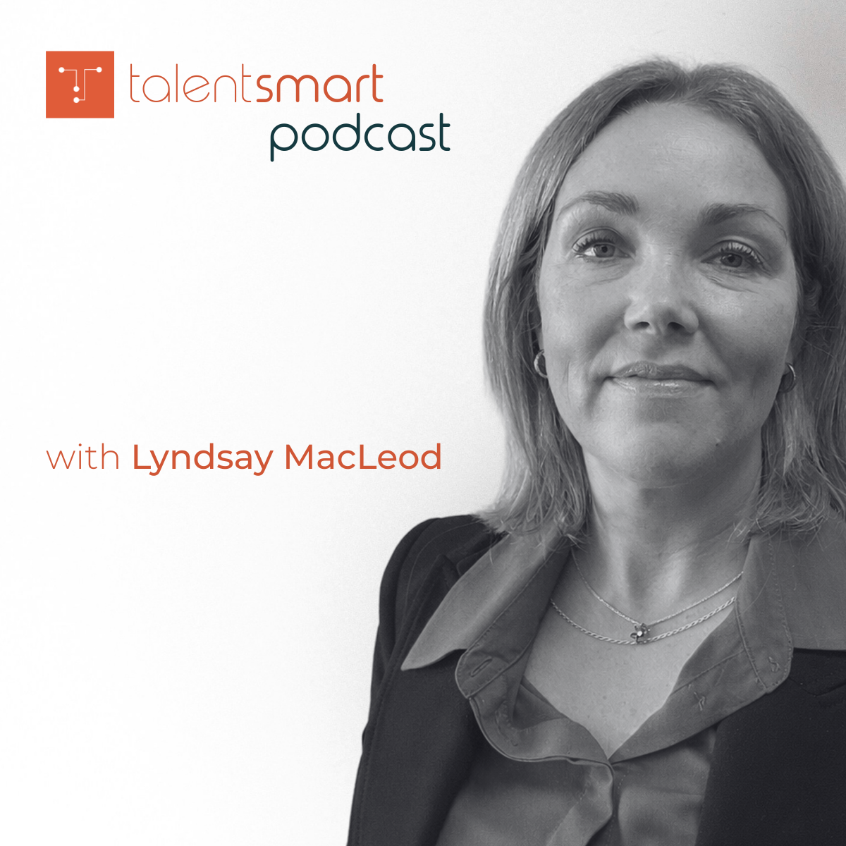
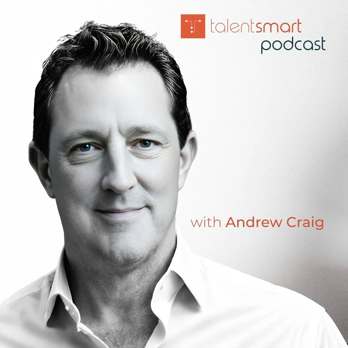
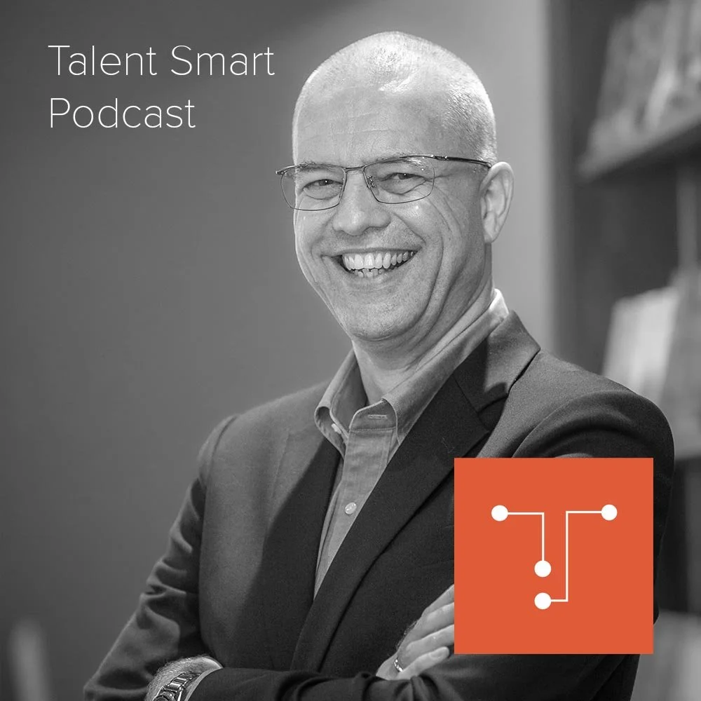
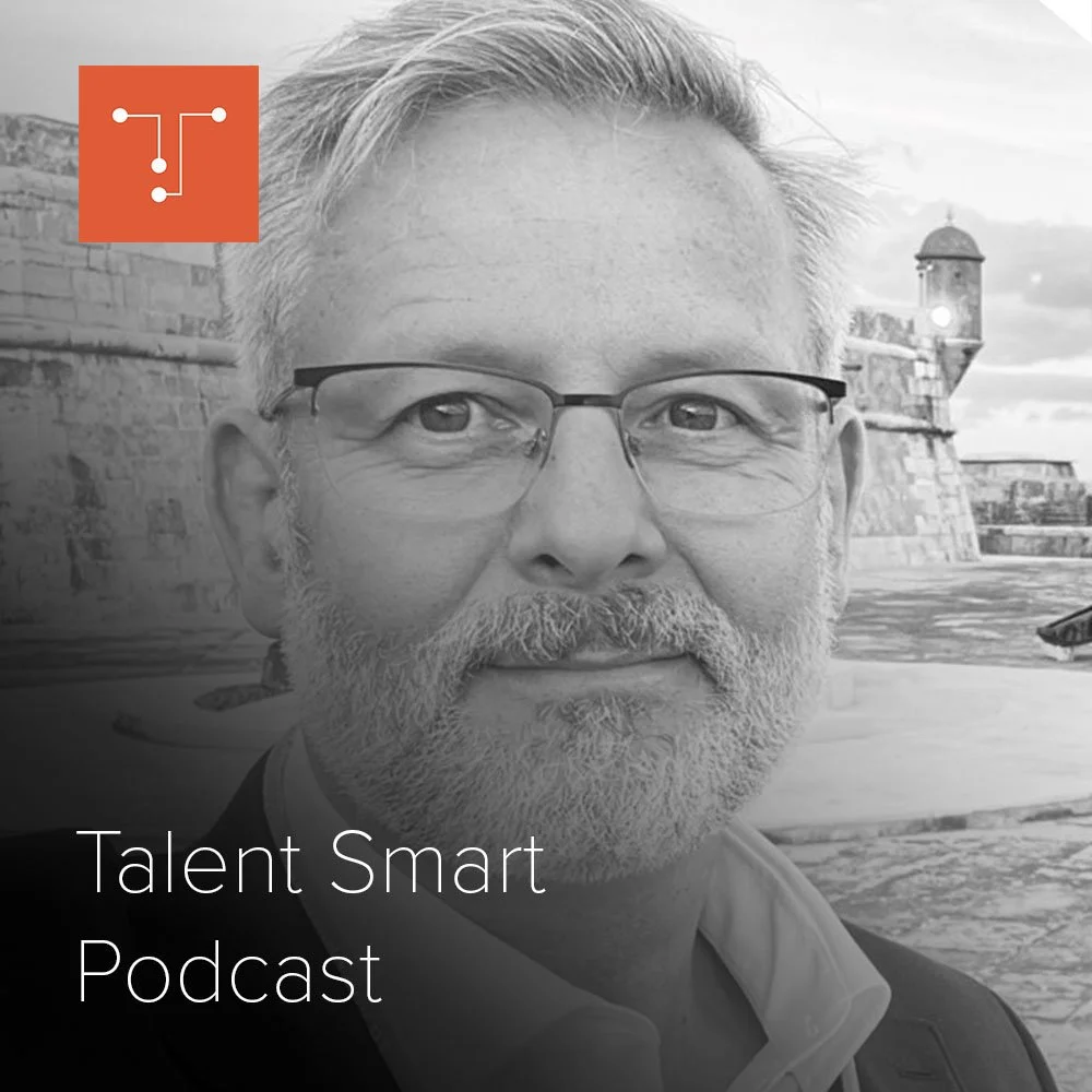
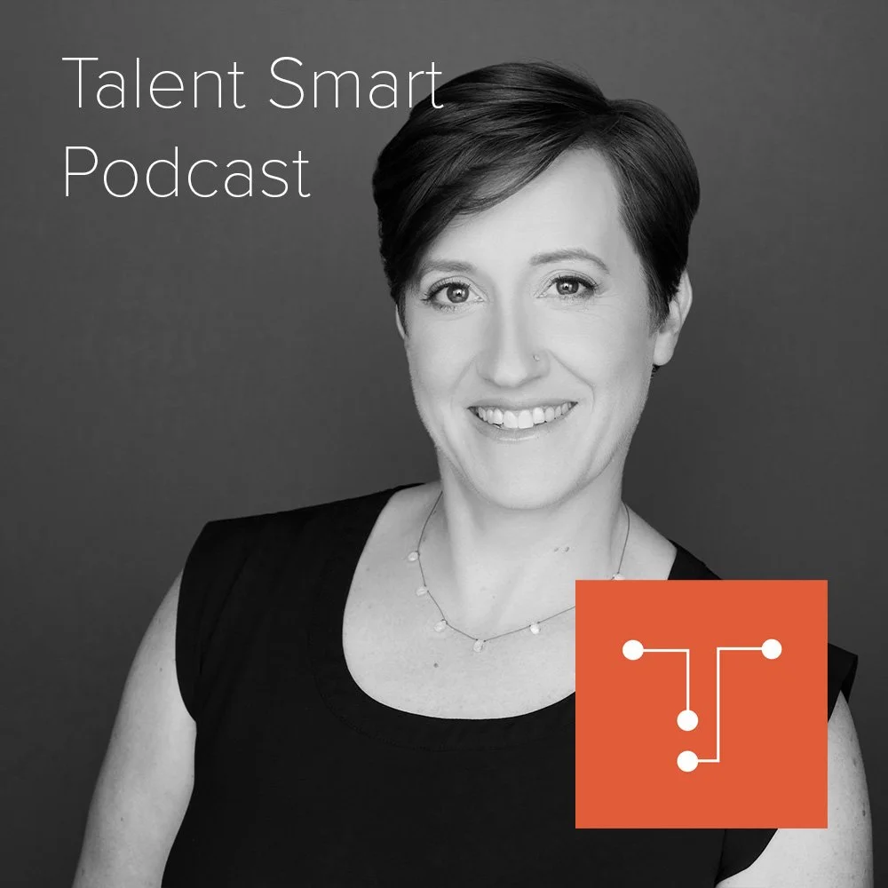
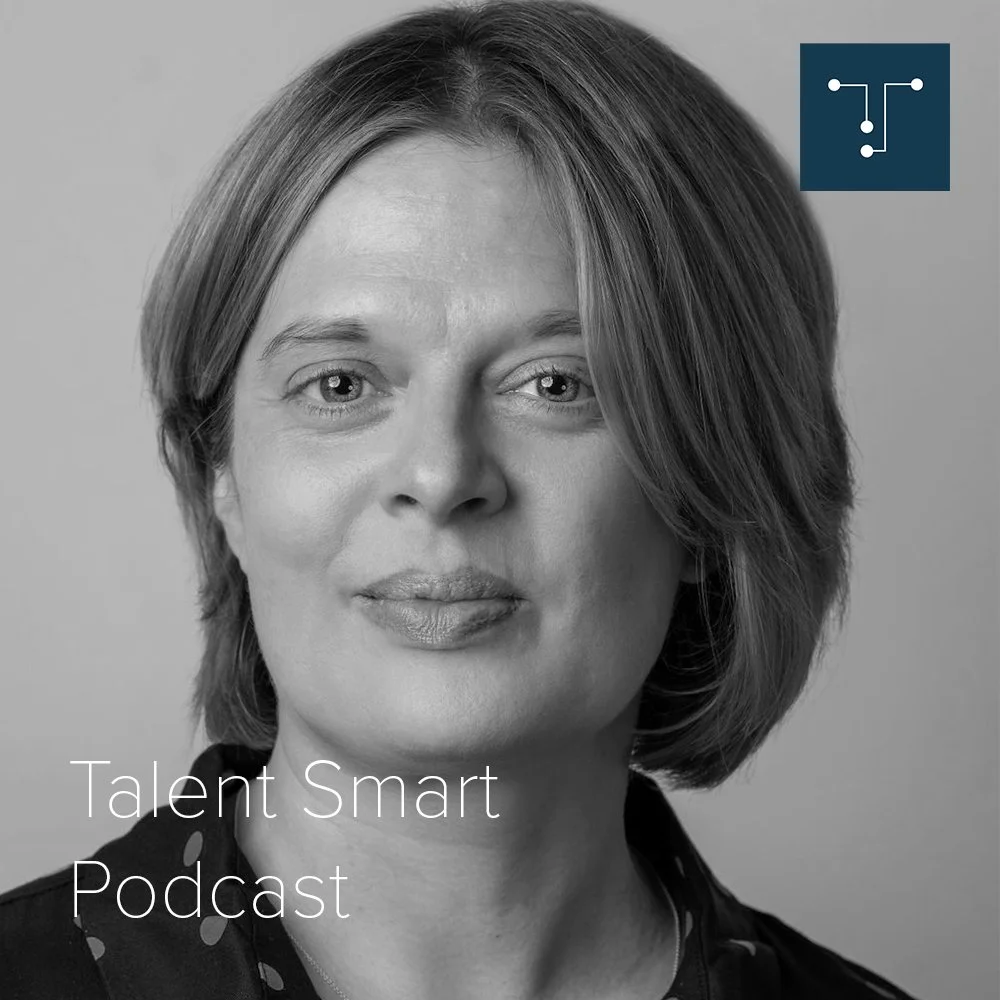
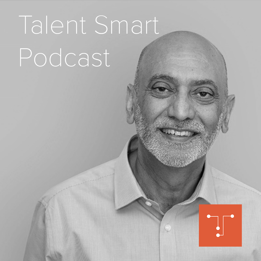
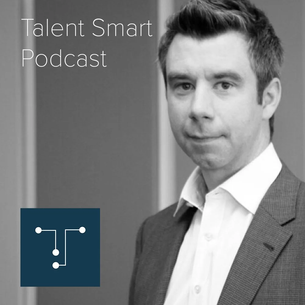
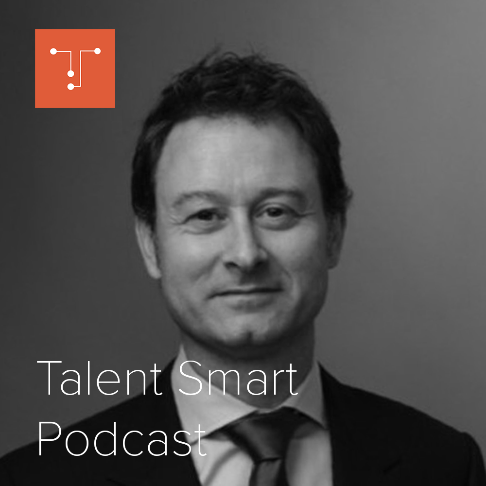
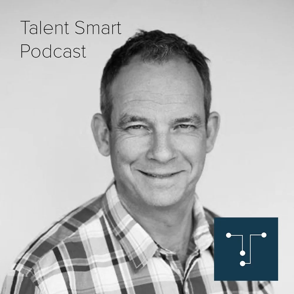
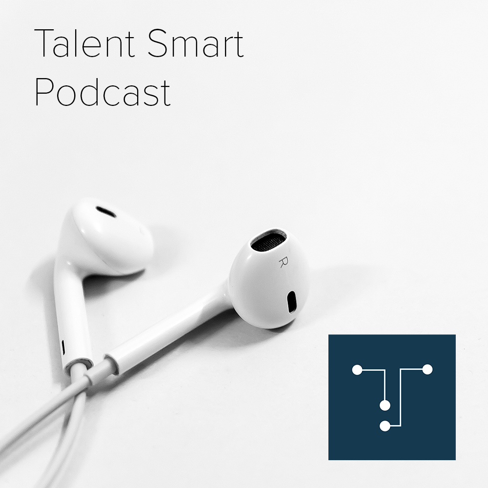
Fifteen of the current podcast covers, as published on talent-smart.co.uk
Website
The current website is easy to navigate and its structure has stood the test of time. The homepage and the podcast page do most of the work. What the site does not yet carry is the brand behind it.
Key Observations
- Clear navigation for clients, candidates and podcast
- Jobs and podcast are one click from the homepage
Refinement Points
- The homepage should say who, what and why in ten seconds
- Make the client the hero, with a clear path for candidates
- Generic copy (“unrivalled service levels”) hides the real story
- Omotenashi, Ikigai and the stories are missing from the homepage
Category Context
Competitors already claim relationships and partnership. Talent Smart cannot win by saying it too. It wins by showing it: the stories, the process and the people behind them.
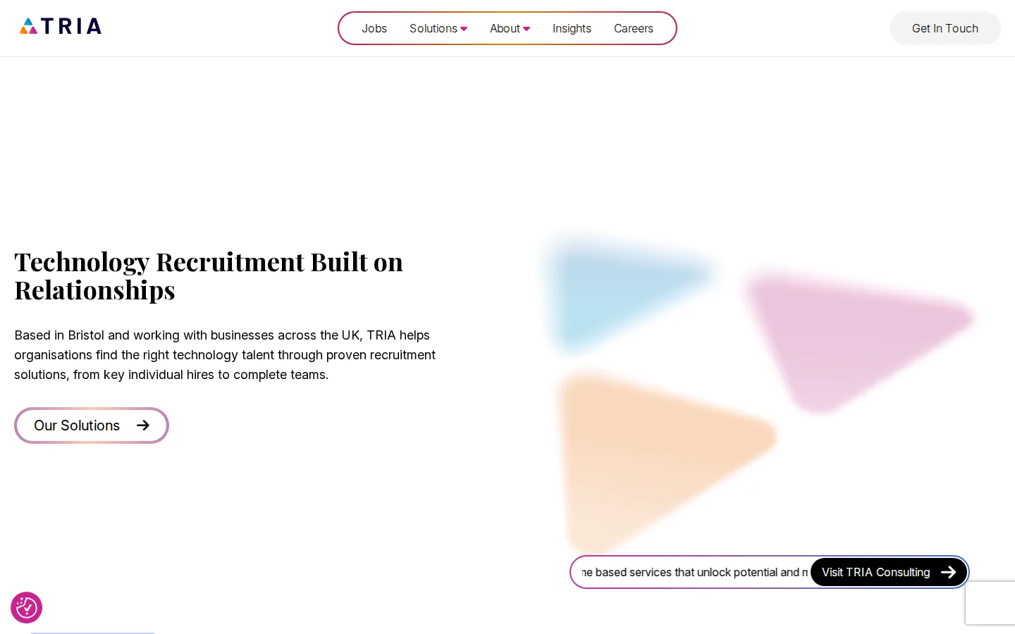
Tria
“Technology Recruitment Built on Relationships.”
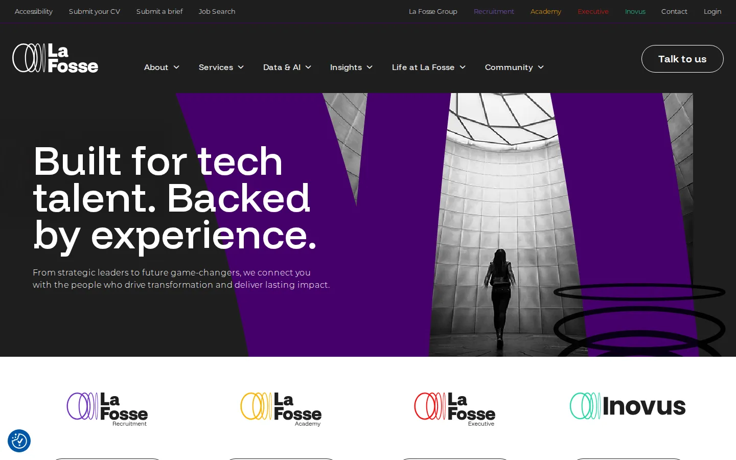
La Fosse
“Built for tech talent. Backed by experience.”
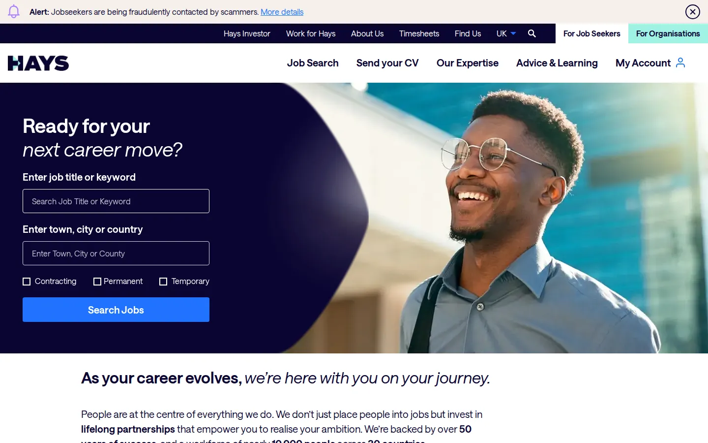
Hays
“We don’t just place people into jobs but invest in lifelong partnerships.”
Audit Summary
The foundations are sound. The work is to sharpen them, make them consistent and let the brand’s real character show.
- The TS mark and its idea of connection
- Orange and navy as the core pair
- Black-and-white guest portraits
- The site’s clear structure and navigation
- Wordmark weights and small-size legibility
- One orange, one navy, accessible contrast
- A single type family with a real hierarchy
- Podcast and social as one template system
- Suited, posed recruitment stock
- Generic, woolly service language
- Off-palette tan and ad-hoc colours
- Layouts that change with every post

Creative Strategy
03
Design Goals
What we aim to express through design
Ten Seconds
Who Talent Smart is, what it does and why it is different, understood at a glance.
Expert
Kindness and competence in the same breath. Never soft, never corporate.
Not Big
Look like the premium small player it is, so clients happily pay for the difference.
System
Podcast, social, decks, jobs and website saying the same thing, the same way.
Design Strategy
The strategy outlines the key visual pillars of the refined brand: aesthetic, colour, typography and mood, ensuring every element works together.
Clean, open layouts with generous space and a clear hierarchy. Contemporary and efficient, with the warmth coming from people, language and colour rather than decoration. Welcoming from the first click, never flashy.
The existing pair stays as the foundation. Orange becomes the signal of warmth and action; navy carries expertise and depth. Supported by warm neutrals, with contrast checked for accessibility.
One primary family the whole team can use across web, decks, social and video, with a defined hierarchy. Not overly corporate. Open-licence options preferred, so every tool the team uses stays on brand.
Real people collaborating and visibly enjoying their work. No suits in a row, no buildings, no clichés. Photography and stories should make it obvious that you will speak to a human quickly.
Key Words
A defined set of keywords captures the essence of the brand and guides tone, style and expression across every visual element.
Logo
The TS mark stays. People recognise it, and its idea, connecting people, is more relevant now than when it was drawn. The work is refinement, not replacement.
For the brand mark, we will balance stroke and node weights so it holds up from a browser tab to a podcast cover, and define how it can work on its own as a graphic device.
For the logotype, we will keep the light and bold rhythm of “talent” and “smart” but set it in weights that stay legible at small sizes and on video.
The studies shown here are early indications only. Final logo options will be proposed in the first visual identity iteration.

Visual Direction
04
Three Directions
Each direction keeps the orange and navy palette and the TS mark as its foundation, then explores a different typography, photography, layout and graphic treatment.
From strategy to visual language
The following slides present each direction individually
Clarity
Understood in ten seconds.
Clear / Calm / Premium
A refined, open direction inspired by the way the best consumer brands explain complex things simply. One type family in three weights, generous white space and a strict grid put the message first: who Talent Smart is, what it does and why it is different. Orange is used sparingly, as the single signal of warmth and action, and the TS nodes become small markers that guide the eye.
Visual Cues
Inter in three weights, large plain-spoken statements, warm white grounds, navy text, orange only for action, candid daylight photography, one idea per screen.
Similar Brands & Websites
- Apple
- Monzo
- Headspace
Understood in ten seconds.



Secrets to successful transformation
Season 3 · Episode 13
Listen now
New role · Contract
Enterprise Data Engineer
Sheffield · Hybrid
£550 per day · Inside IR35
Data platforms, Azure, dbt
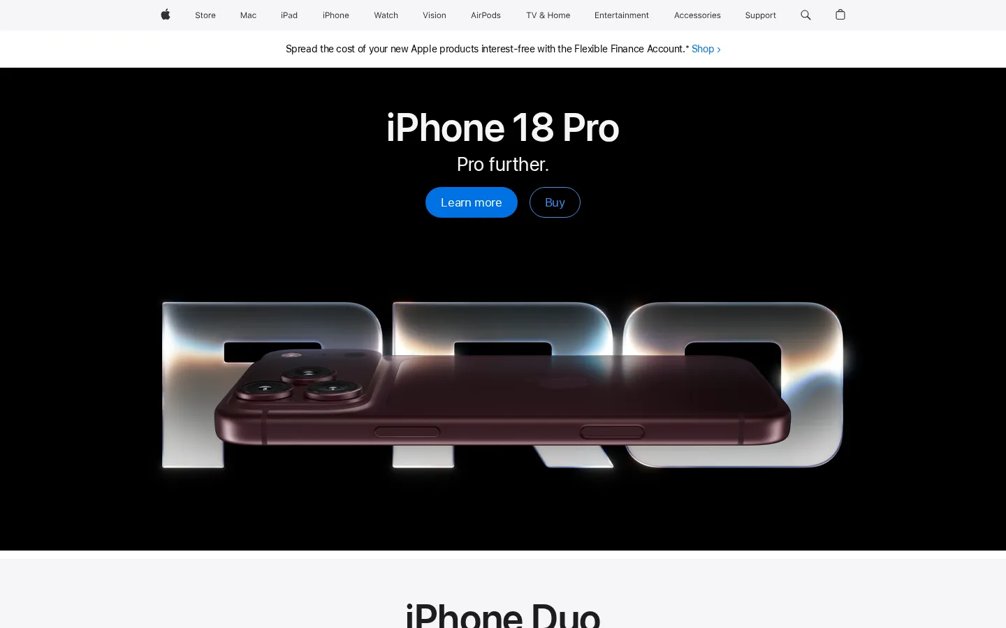
Direction 1 · Clarity


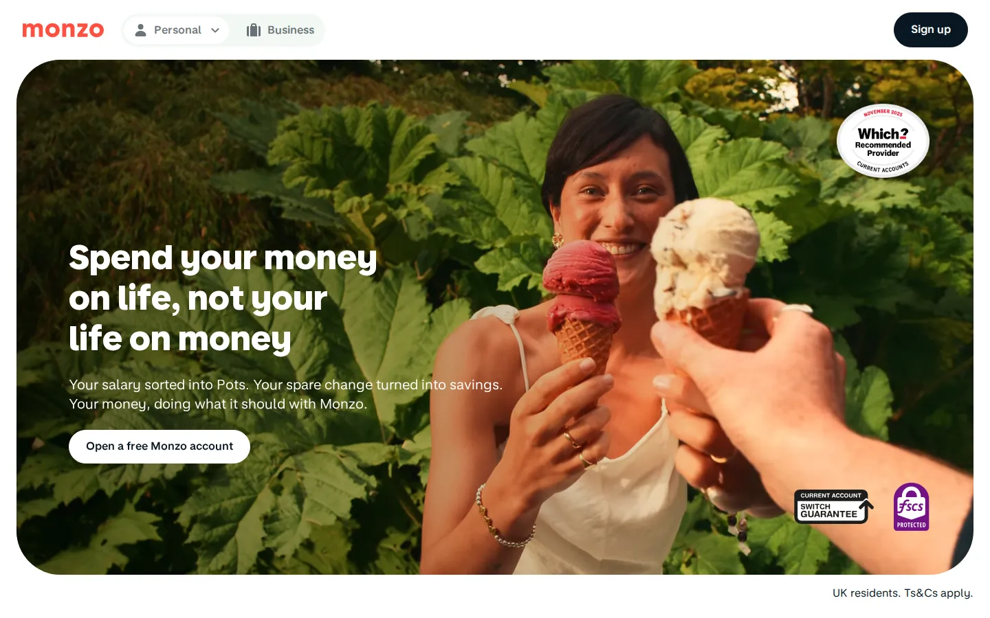

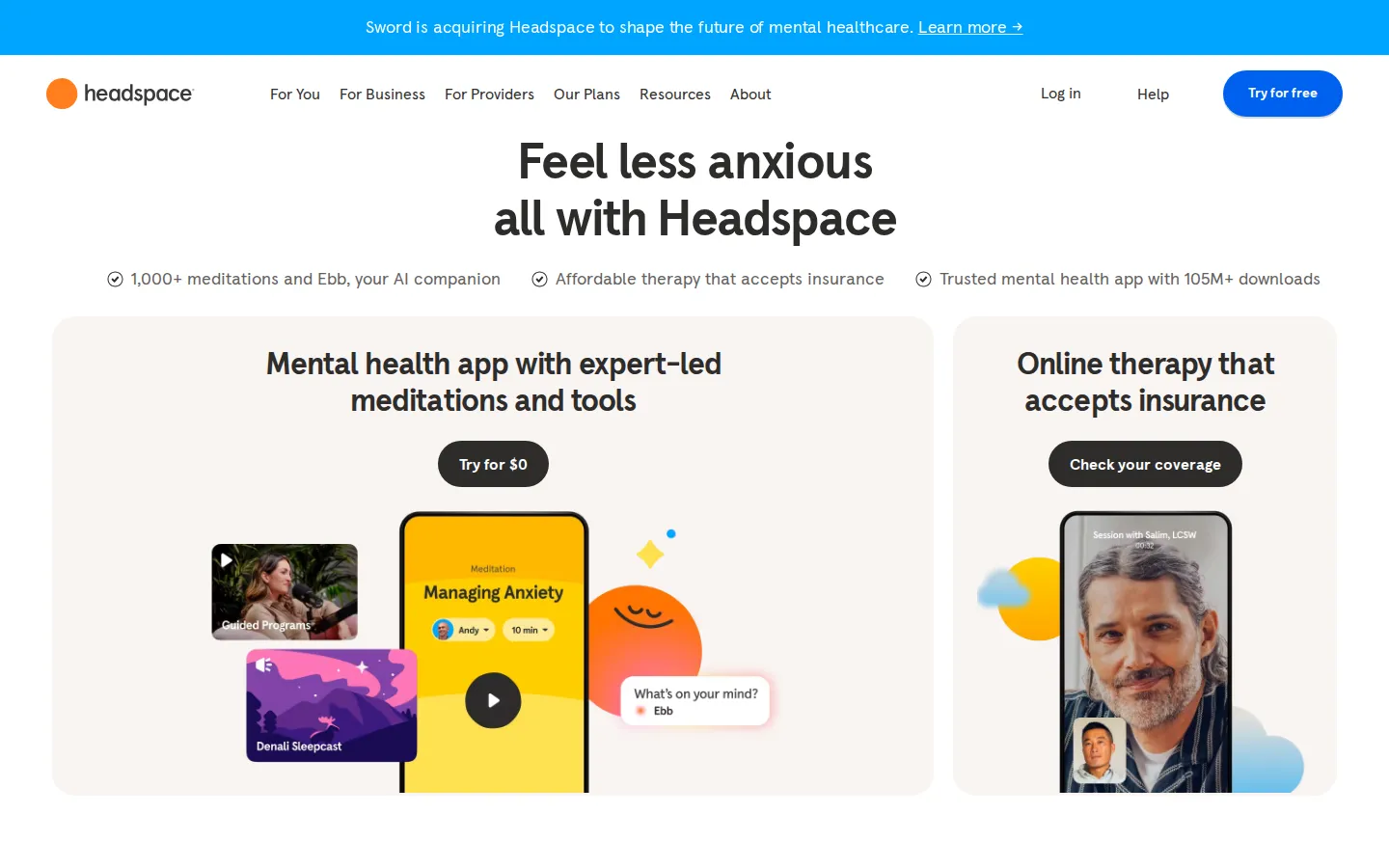

Large, simple headlines in one family. The copy does the work; nothing competes with it.
Candid people in bright, natural light, photographed mid-conversation rather than posed.
One colour for warmth and action: calls to action, key numbers and the TS nodes.
Generous space and a disciplined grid make the brand feel premium and calm.
References: Apple, Monzo, Headspace (screenshots, for art direction only). Photography: Pexels, art direction only.
Stories
Tell the story, not the fee.
Human / Warm / Editorial
An editorial direction that puts the people first: the candidates placed, the clients helped and the podcast guests. A warm serif for headlines and quotes, paired with a clean sans for information, gives the brand a voice that feels considered and personal. Documentary photography with a warm grade, big pull quotes and case stories such as Eduardo’s make the proof visible.
Visual Cues
Newsreader serif with Inter, pull quotes, warm ivory grounds, documentary colour photography, black-and-white guest portraits, orange quotation marks and underlines.
Similar Brands & Websites
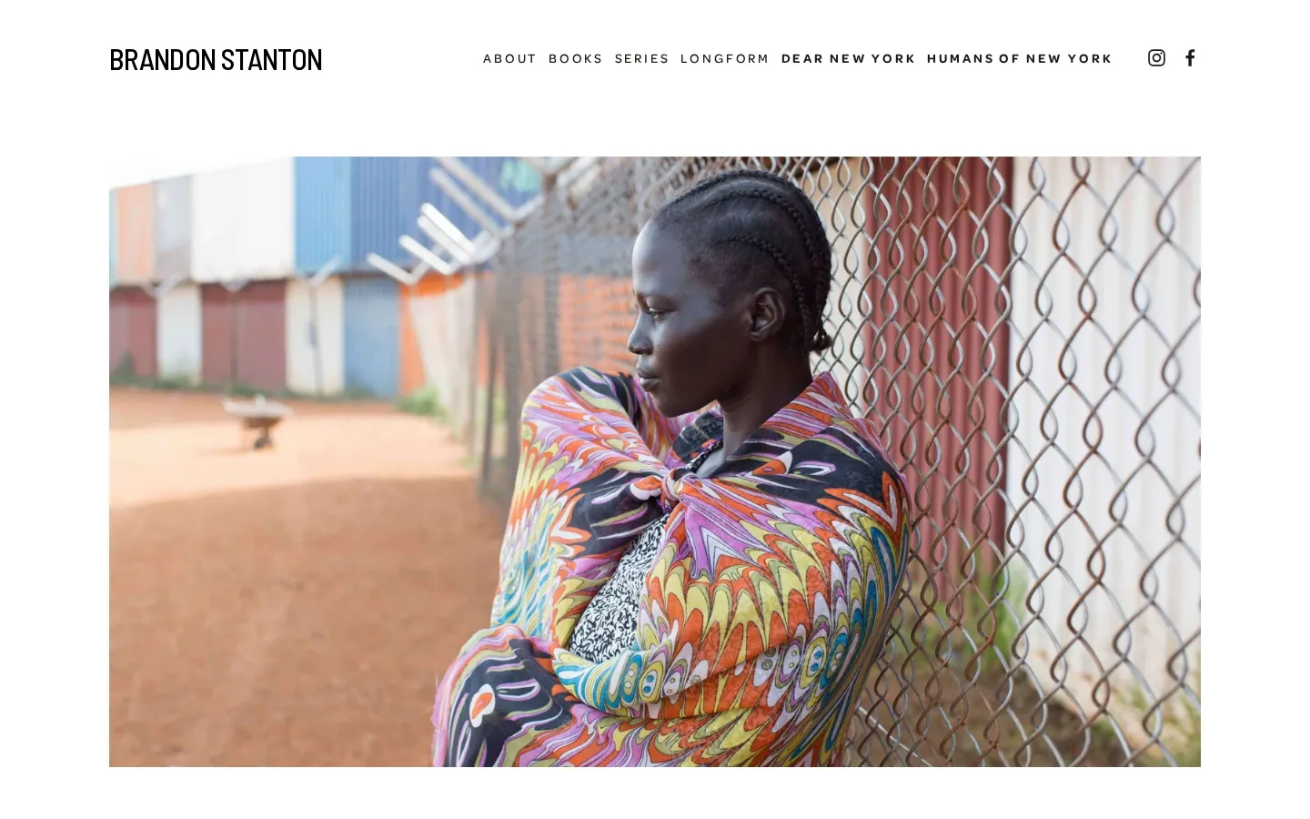
- Humans of New York
- Kinfolk
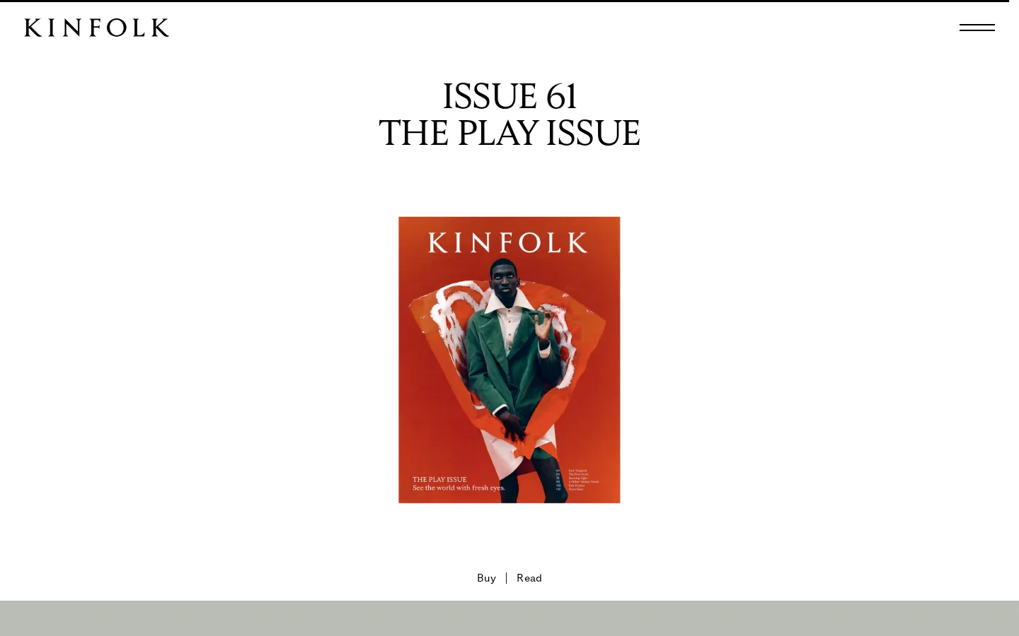
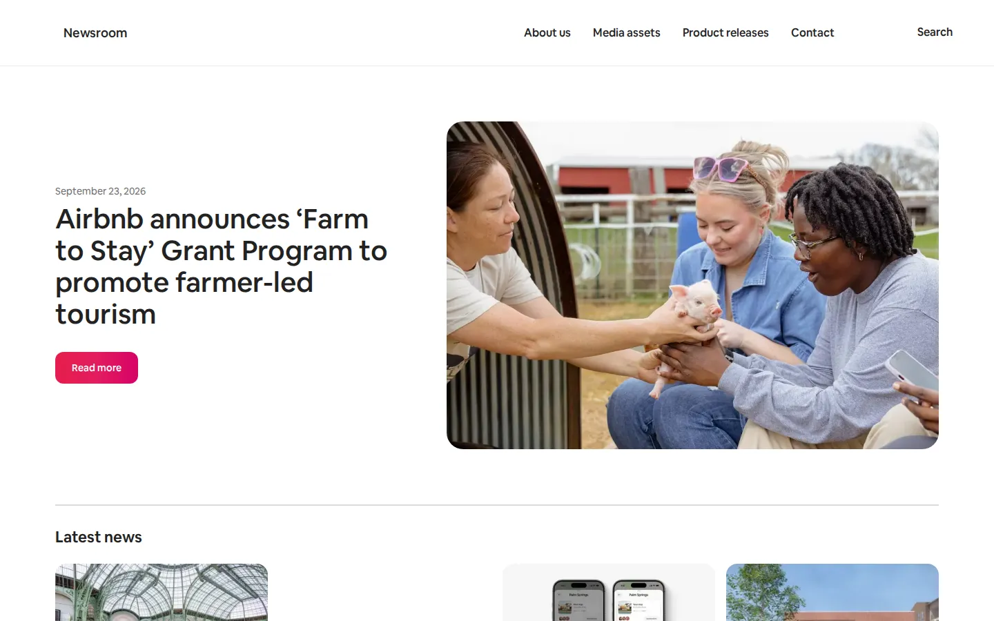
- Airbnb Newsroom
Tell the story, not the fee.
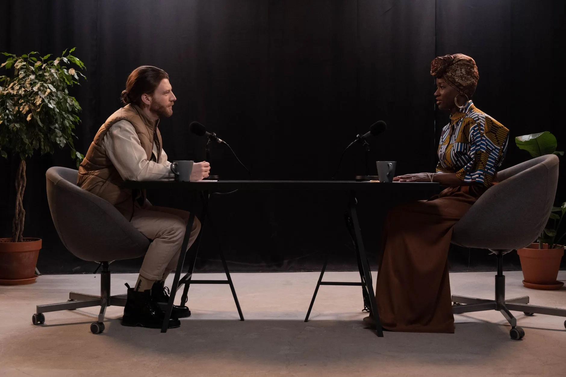
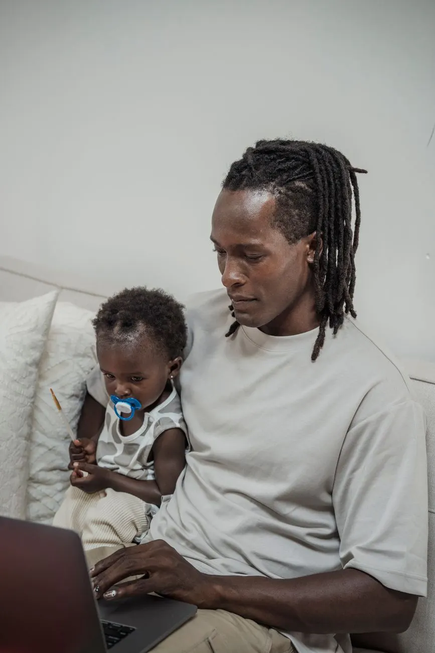
Placed by Talent Smart
From delivery rider to Chief Platform Engineer.
Eduardo’s story, Carnival. Read the case story →
Direction 2 · Stories

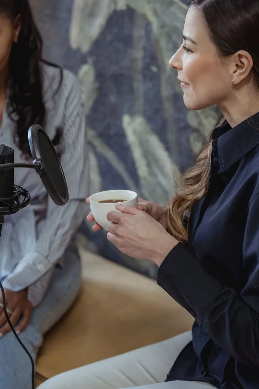
A warm, readable serif for headlines and quotes brings personality without formality.
Real moments, warm grade, natural settings. The person is always the subject.
Case stories, podcast quotes and guest portraits become the core of social and web.
Oversized quotation marks in orange turn a guest’s words into the visual.
References: Humans of New York, Kinfolk, Airbnb Newsroom (screenshots, for art direction only). Photography: Pexels, art direction only.
Network
Known and trusted. Your network’s network.
Connected / Structured / Modern
A direction that grows the TS mark into a complete graphic system. The lines and nodes of the mark extend across layouts, linking people, podcast episodes, sectors and jobs, and visualising the network that sets Talent Smart apart. A geometric sans that echoes today’s rounded wordmark, with a monospaced label face, modular cards on navy and black-and-white cut-out portraits make it feel contemporary and quietly technical.
Visual Cues
Outfit, a geometric sans close to the current wordmark, with DM Mono labels, connecting lines and nodes from the mark, navy grounds, modular cards, black-and-white cut-out portraits, orange nodes marking people and moments.
Similar Brands & Websites
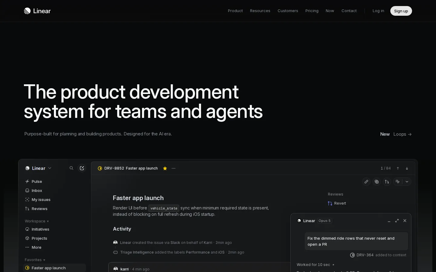
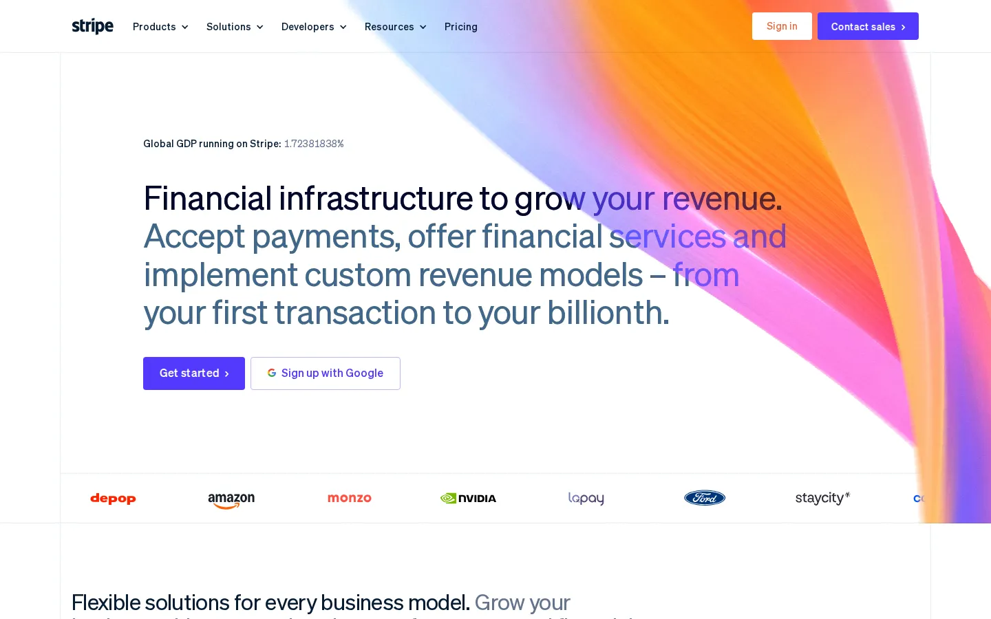
- Linear
- Stripe
- Wise
Known and trusted. Your network’s network.

CONTRACT / DATA / SHEFFIELD
Enterprise Data Engineer
● 3 PEOPLE IN OUR NETWORK MATCH
Direction 3 · Network


The mark’s paths extend across layouts to connect people, topics and jobs.
A card system that scales from a job post to a podcast series to a full website.
A monospaced label face adds a precise, modern layer to sector tags and data.
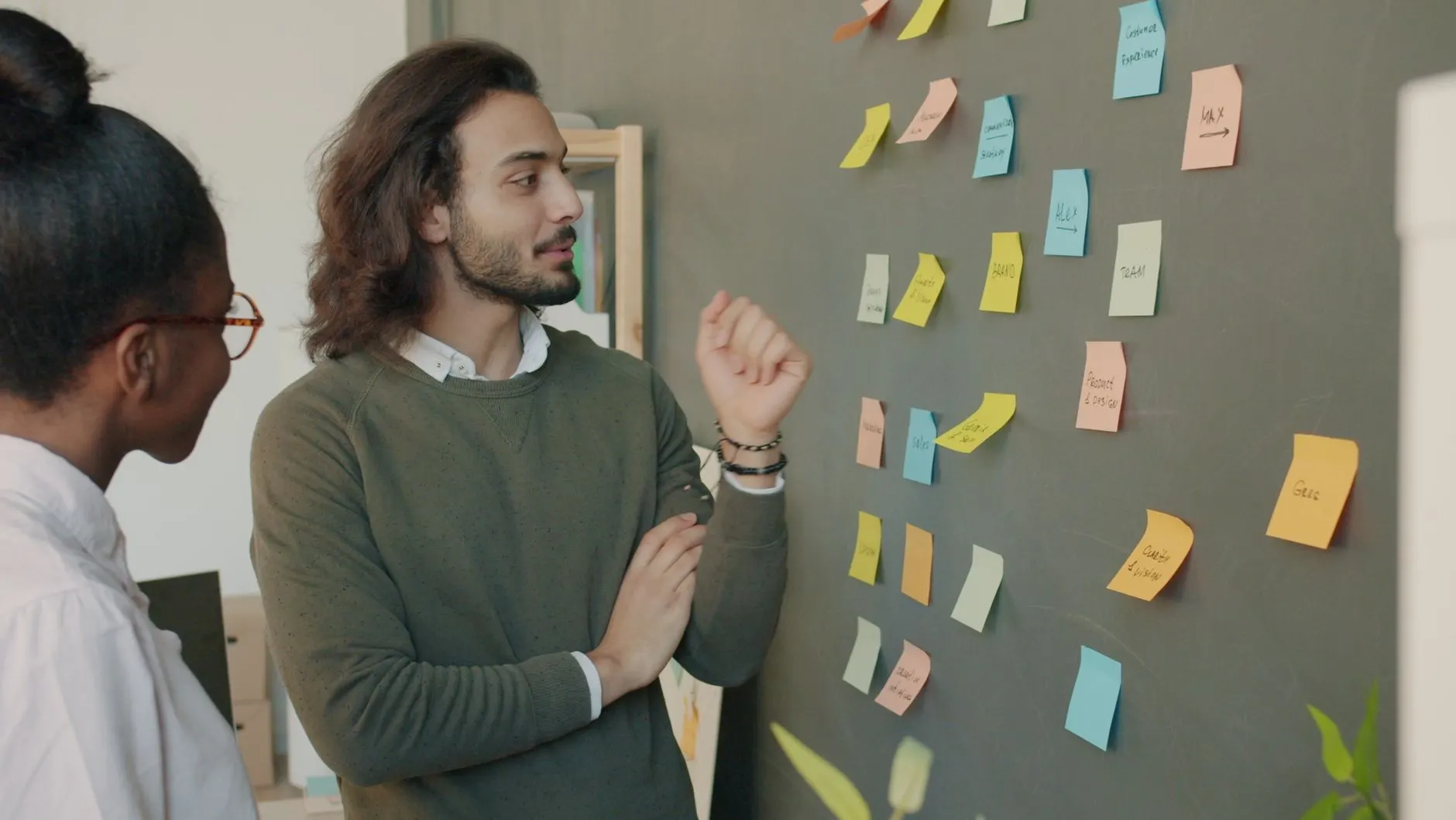
Black-and-white portraits, continuing the podcast’s strongest asset, placed on the network.
References: Linear, Stripe, Wise (screenshots, for art direction only). Photography: Pexels, art direction only.
Selecting a
Direction
We’ve developed three directions for Talent Smart. Each is rooted in the same strategy, the same colours and the same mark, and explores a different way to express warmth, expertise and clarity.
How to select
- Which direction feels most like the Talent Smart of the next four years
- Whether the brand should lean clearer, more human or more connected
- How typography, photography and graphic treatments resonate
- Any elements you’d like us to develop further, refine or combine
We will walk through every direction on a call, describing colour and contrast choices in words as well as pictures.
Following review and discussion, the next stage will focus on refining the selected pathway.
This will include:
- Refining the logotype and TS brand mark
- Defining the typography system
- Finalising the colour palette and contrast rules
- Developing the brand visual system and guidelines
- Designing the social template set
We look forward to speaking soon and refining the direction together.